
National Confectionary Association
PROBLEM
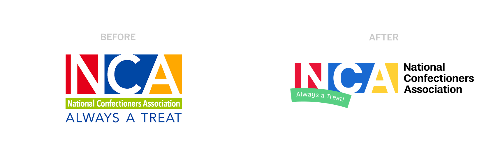
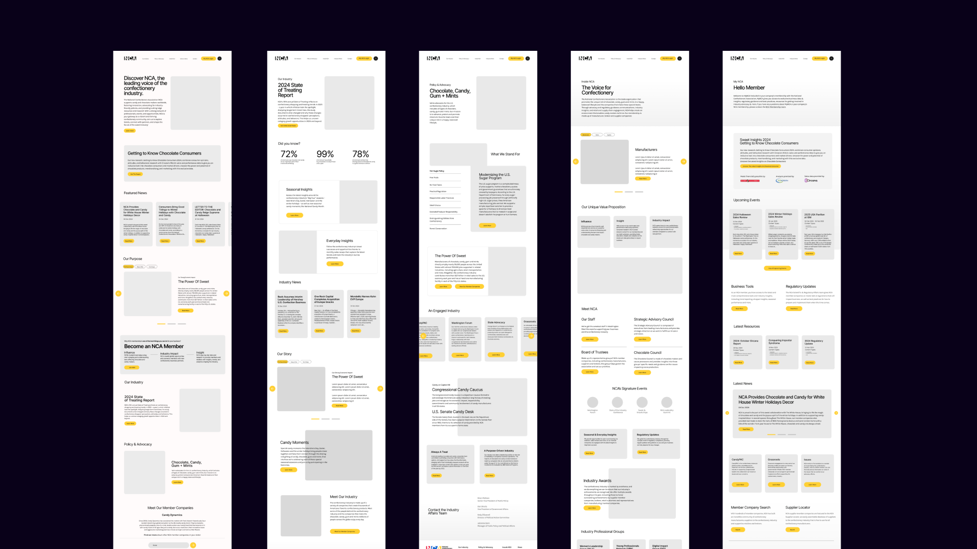
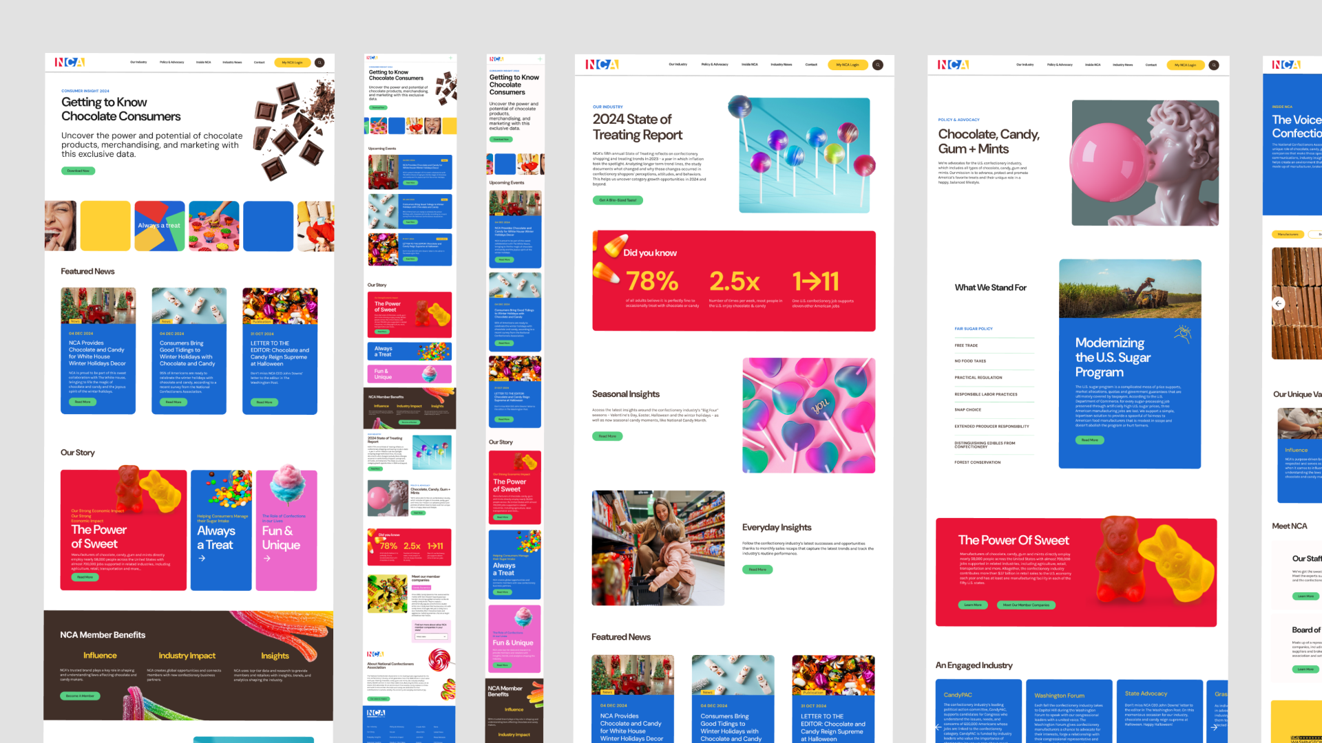
The National Confectioners Association (NCA) had a website and brand presence that was cluttered and a bit overwhelming. They had a lot of colors and elements that made the user experience less intuitive and not as user-friendly as it could be. They needed a refresh that would not only update their branding but also overhaul the UX and UI to guide their users more effectively.
NEED
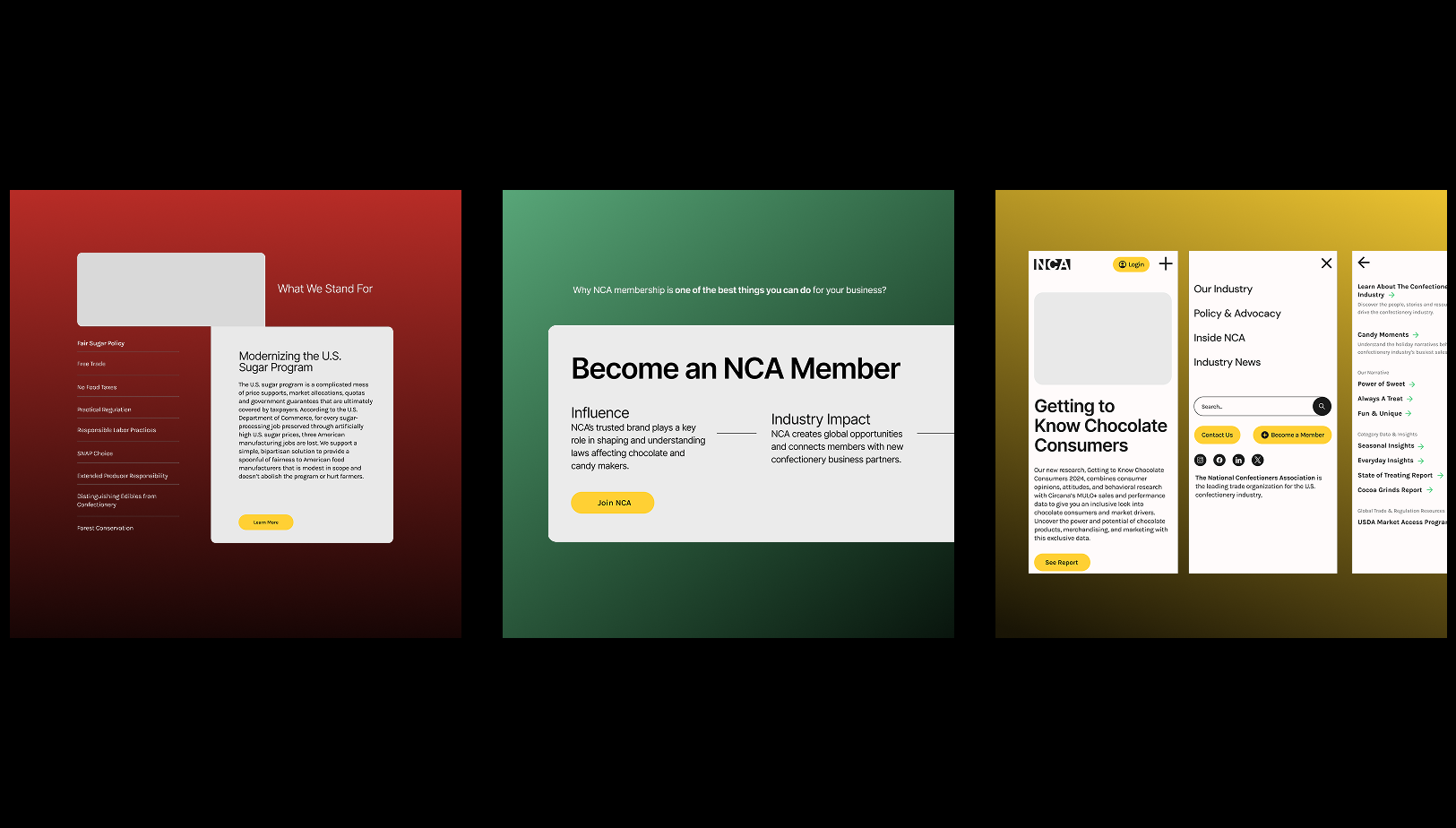
They needed to simplify and modernize their entire digital presence. We had to find a way to educate them on best practices and then implement those changes so that their site would be easier to navigate and more accessible, all while giving the brand a fresh, clean look.
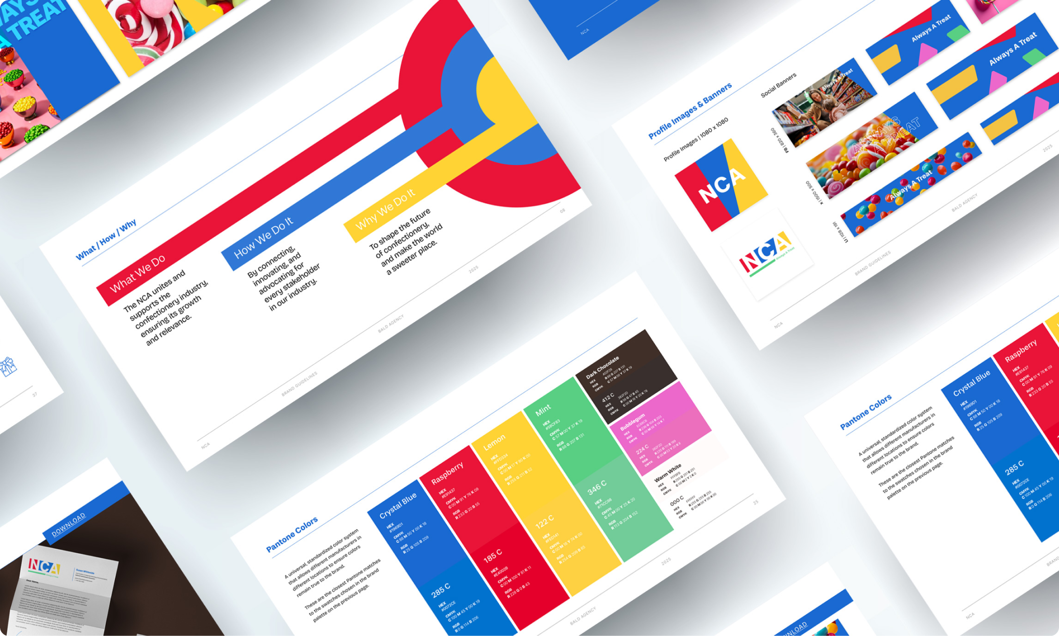
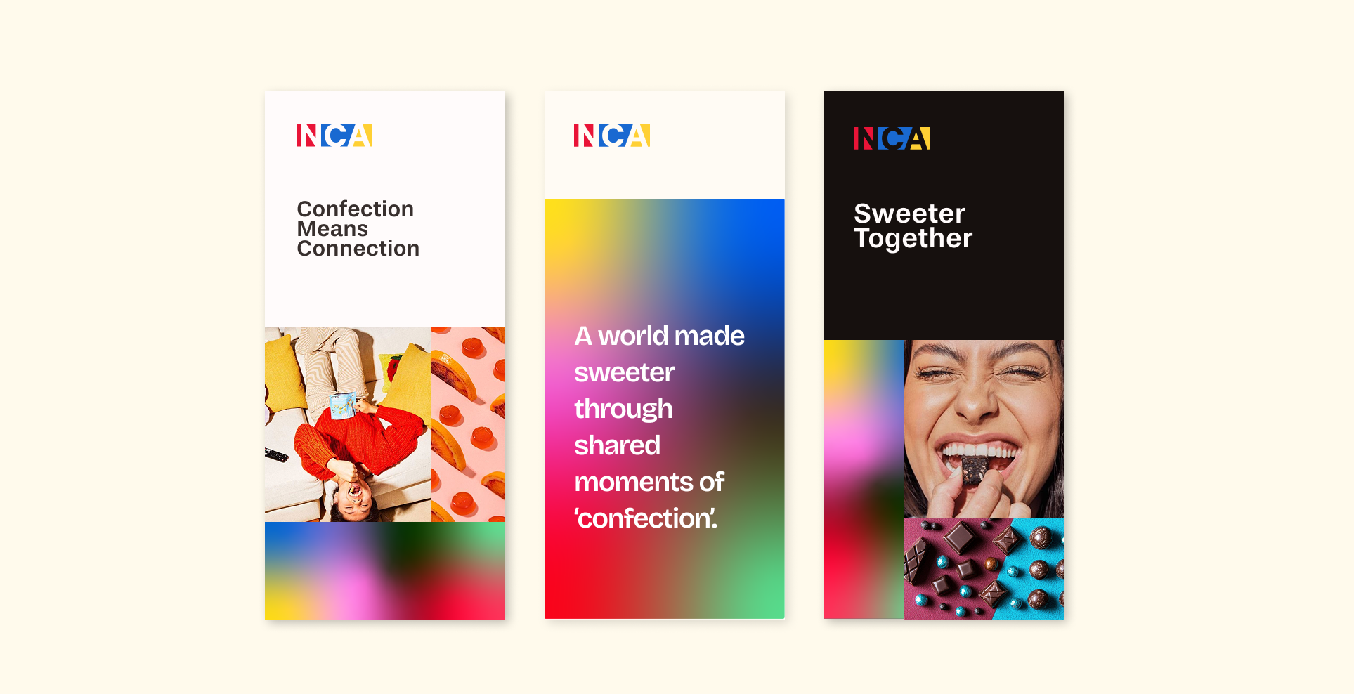
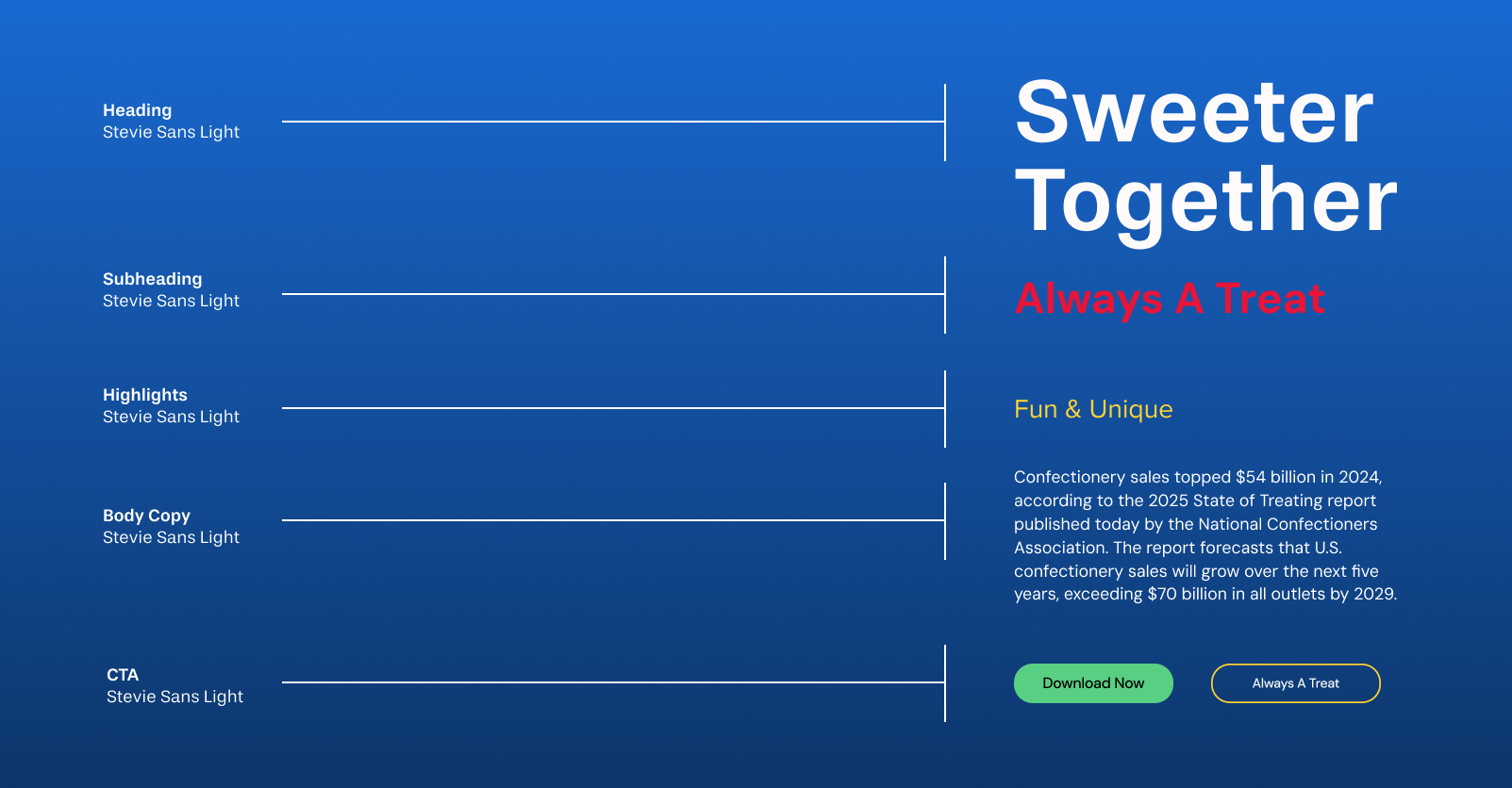
Brand Refresh
UX Design
UI Design Templates
SOLUTION
Together, we streamlined their branding by simplifying the color palette and making everything more cohesive. We did a deep dive into UX best practices, basically gave them a masterclass on how to make their site user-friendly, and then redesigned the website to be both beautiful and easy to navigate. The result is a refreshed, accessible hub that serves as a go-to resource for their customers and partners in the confectionery and chocolate world, making everything simpler yet wonderfully effective.

Project Designed as Lead UX/UI Designer and Design Director at Bald Agency